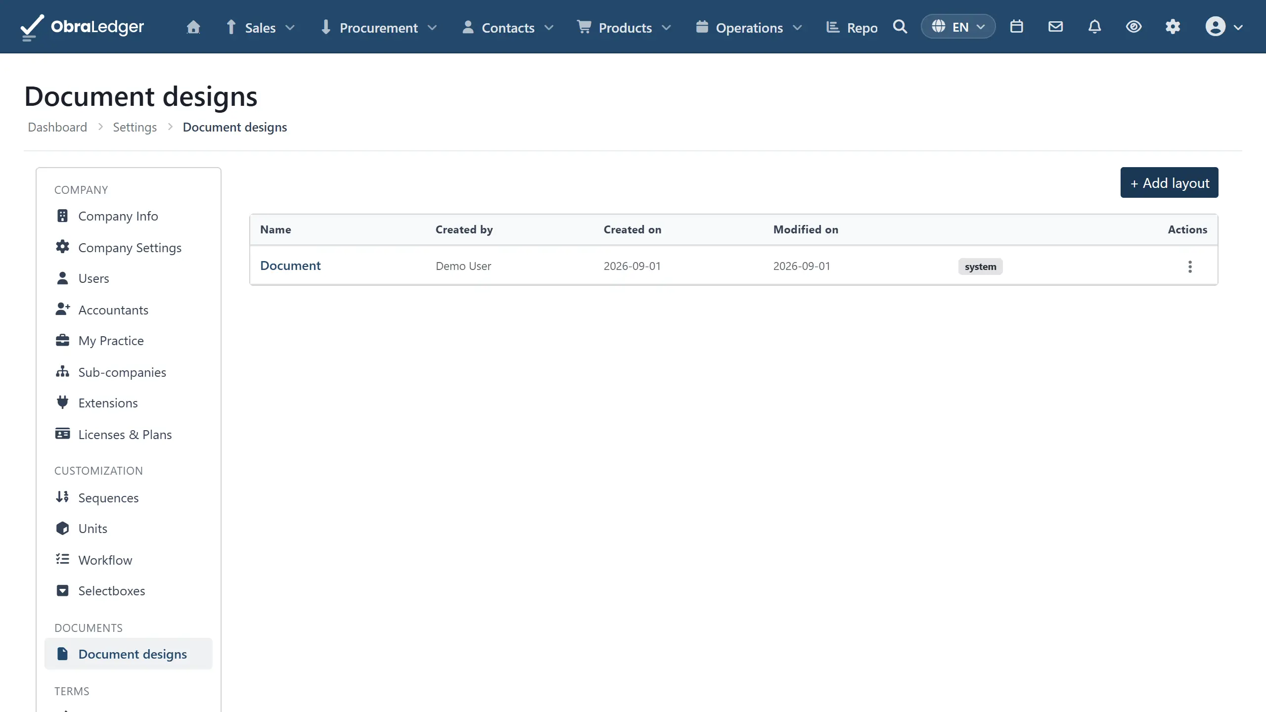
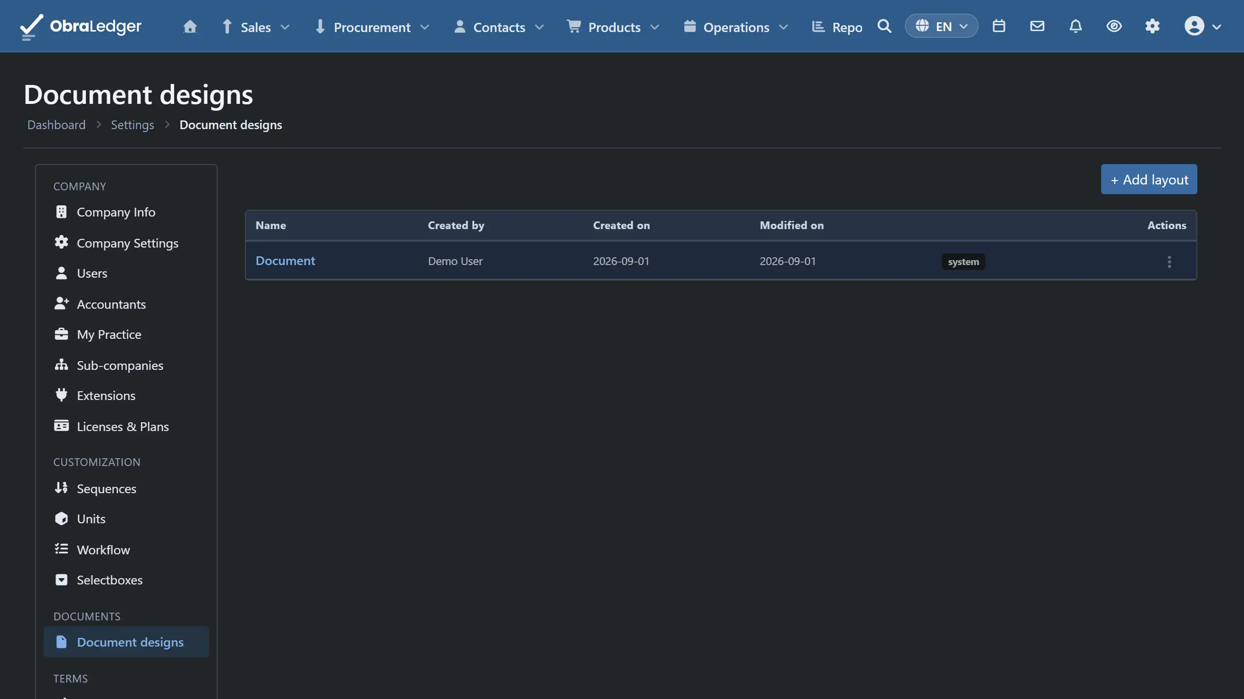
Your invoice is the one page most customers ever read. They never see your stock levels or your ledger, but they read the thing you send them asking for money, and it tells them what sort of business you are.
So the document is yours to build, not a template with your logo dropped into the corner of somebody else’s layout.
What you can do
- Put blocks where you want them. Drag them onto the page and size them; nothing is nailed to a fixed position.
- Choose from a long list of blocks: your logo, billing and shipping addresses, the line items, document details, totals, tax summary, payment details, bank details, a payment advice slip, a QR code, notes, terms, contact details, delivery details, a project or PO reference, a signature, a quote approval, social links, a promotional banner, attachments, free text and images.
- Set the typography once for the whole document - font, size, color - and let every block inherit it.
- Override any of it on a single block, when one thing needs to look different.
- Give the page a header, a footer and a page number, each switched on or off on its own.
- Put a background image behind the page, which is how you get a watermark.
- Add a cover page.
- Say where a page break falls, rather than letting the printer decide.
- Vary the design per document type, so a quote and an invoice can differ where they need to while sharing everything else.
- Export a design and import it again, or copy one to another company you run.
How it works in practice
Start from the document global style. With nothing selected, you’re editing the whole document: base font, size, color, and the page’s background and padding. Everything you place inherits from here, so setting it first saves overriding it twenty times later.
Drag the blocks you need onto the page. Each one is a rectangle you position and size. A block you haven’t placed doesn’t render, so building up from an empty page is a legitimate approach - and so is deleting the ones you never use.
Select a block to style it. Each has its own settings panel for what it contains, plus font and color controls. The order is worth knowing: the document’s global style applies first, then anything you set on the block, then anything you’ve set for that specific document type. The most specific one wins.
Set up the page areas separately. The header, footer and page number aren’t blocks on the page - they’re areas of it, each with its own content and its own switch. The background image and cover page work the same way.
Then vary it by document type. Design once, and where an invoice needs something a quote doesn’t, change it on that type alone. What you don’t override stays shared, so fixing your logo fixes it everywhere.
Copy it to your other companies. If you run more than one, a design built once can be brought across rather than rebuilt. See users, roles and companies.
Good to know
- It renders to a real PDF, not a print stylesheet, so what you design is what arrives.
- Design your longest document, not your shortest. A layout that looks right with three line items can overflow with thirty. Check a real document with a full table before you rely on it.
- A tall header or footer eats the body. The page reserves the area you give it, so a deep banner leaves less room for the invoice itself. That’s the correct behavior, and it’s worth seeing at full page length before you decide.
- The accepted-payment-methods line is text you write, not card logos. Card-brand artwork was considered and left out: an icon set invites showing a mark you don’t actually accept, and redistributing those marks isn’t ours to do. If you want a badge, add it as an image.
- Older accounts may still be on an earlier editor. The current one replaced previous versions, and long-standing tenants can still be on the old designs until they’re moved.